

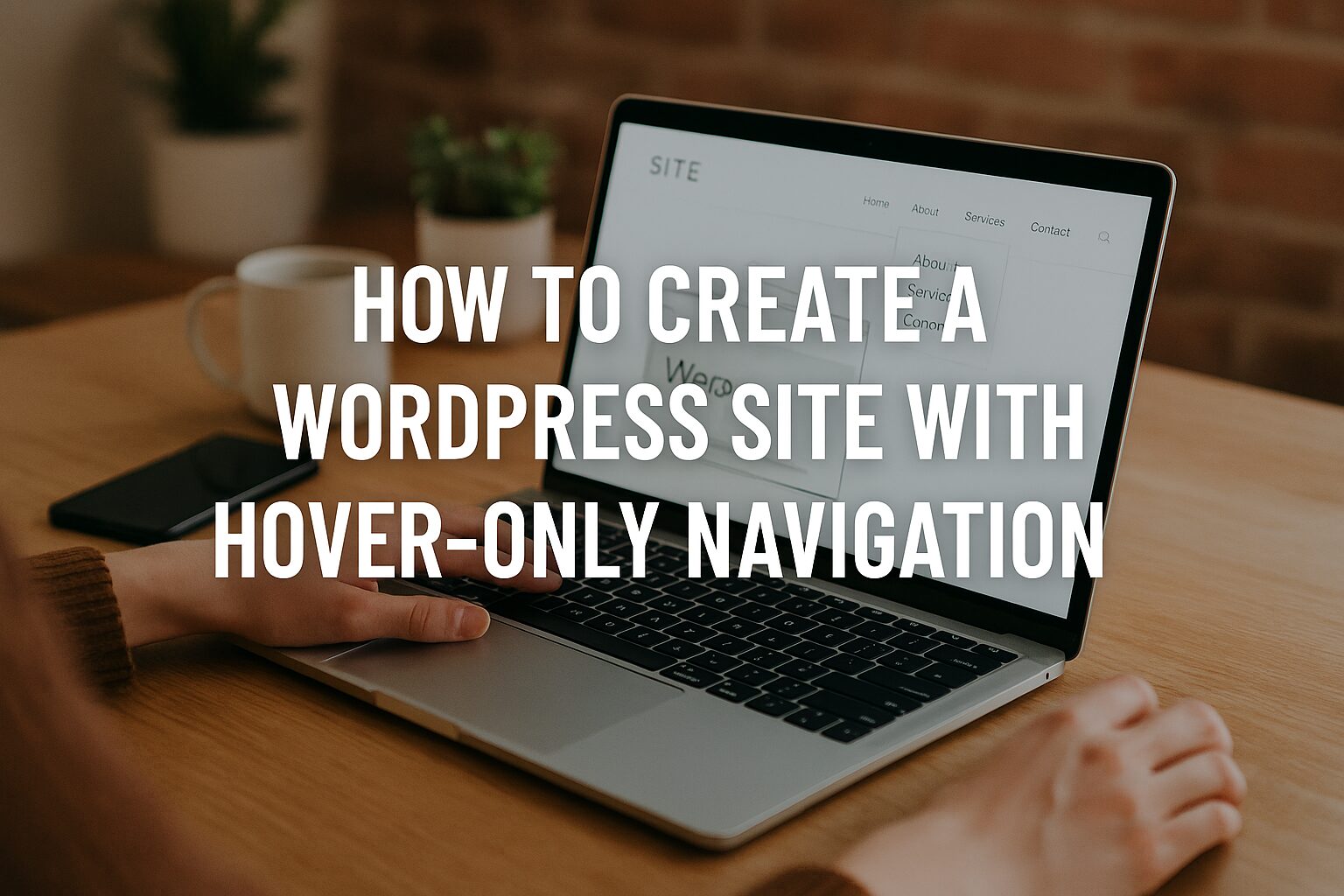
How to Create a WordPress Site with Hover-Only Navigation
Implementing Modern, Minimalist Navigation That Appears on Hover
Hover-only navigation creates a sleek, distraction-free interface where menu elements only appear when users need them. This contemporary approach maximizes content space while maintaining accessibility and discoverability. Here’s how to implement it effectively in WordPress.
Why Use Hover-Only Navigation?
- Maximized Content Focus – Removes visual clutter when not needed
- Modern Aesthetic – Creates clean, minimalist interfaces
- Improved Engagement – Encourages exploration through discovery
- Space Efficiency – Ideal for content-heavy or portfolio sites
- Subtle Animation – Adds sophisticated micro-interactions. Our YouTube channel; https://www.youtube.com/@easythemestore
Implementation Methods
1. CSS-Only Solution (Recommended)
/* Hide main navigation by default */
.primary-nav {
  opacity: 0;
  transform: translateY(-10px);
  transition: opacity 0.3s ease, transform 0.3s ease;
  pointer-events: none;
}

/* Show on parent hover */
.header:hover .primary-nav,
.primary-nav:hover {
  opacity: 1;
  transform: translateY(0);
  pointer-events: auto;
}

/* Mobile fallback */
@media (max-width: 768px) {
  .primary-nav {
    opacity: 1;
    transform: none;
    pointer-events: auto;
  }
}
2. WordPress Menu Implementation
Add to your theme’s functions.php:
function register_hover_menu() {
  register_nav_menu('hover-menu', __('Hover Navigation'));
}
add_action('after_setup_theme', 'register_hover_menu');
Then in your header template:
php
<nav class="primary-nav">
  <?php wp_nav_menu(array('theme_location' => 'hover-menu')); ?>
</nav>
3. JavaScript Enhancement
// Add delay for better UX
let navTimer;
const nav = document.querySelector('.primary-nav');

document.querySelector('.header').addEventListener('mouseenter', () => {
  clearTimeout(navTimer);
  nav.classList.add('visible');
});

document.querySelector('.header').addEventListener('mouseleave', () => {
  navTimer = setTimeout(() => {
    nav.classList.remove('visible');
  }, 300); // 300ms delay before hiding
});
Design Best Practices
- Visual Cue – Add subtle indicator (like a menu icon) when hidden
- Fast Response – Keep hover activation under 0.3s
- Large Hit Area – Expand hover zone beyond just text
- Accessibility – Ensure keyboard navigable with
:focusstates - Mobile Fallback – Convert to standard menu on touch devices
Accessibility Considerations
/* Keyboard navigation support */
.primary-nav a:focus {
  opacity: 1 !important;
  transform: none !important;
}

/* Screen reader support */
.sr-only {
  position: absolute;
  width: 1px;
  height: 1px;
  padding: 0;
  margin: -1px;
  overflow: hidden;
  clip: rect(0, 0, 0, 0);
  white-space: nowrap;
  border: 0;
}
Advanced Variations
1. Directional Reveal
/* Slide from left */
.primary-nav {
  transform: translateX(-100%);
}

.header:hover .primary-nav {
  transform: translateX(0);
}
2. Gradient Fade-In
.primary-nav {
  mask-image: linear-gradient(to bottom, transparent 0%, black 20%);
  transition: mask-position 0.3s ease;
  mask-position: 0 -100%;
}

.header:hover .primary-nav {
  mask-position: 0 0;
}
3. Circular Menu
.menu-toggle {
  position: fixed;
  top: 20px;
  right: 20px;
  width: 50px;
  height: 50px;
  border-radius: 50%;
}

.menu-items {
  position: absolute;
  top: 0;
  left: 0;
  opacity: 0;
  transform: scale(0);
  transform-origin: center;
  transition: all 0.3s ease;
}

.menu-toggle:hover .menu-items {
  opacity: 1;
  transform: scale(1);
}
Plugins for Hover Navigation
- Max Mega Menu – Advanced hover options
- WP Mobile Menu – Custom hover behaviors
- Menu Icons – Add visual indicators
- Smart Slider 3 – For hover-triggered mega menus
Final Thoughts
Hover-only navigation can elevate your WordPress site’s design when implemented thoughtfully. Remember to:
- Always provide clear visual cues
- Maintain keyboard accessibility
- Test on various devices
- Keep animations fast and smooth
- Consider combining with other modern UI patterns
This approach works particularly well for portfolio sites, creative agencies, and content-focused platforms where maximizing screen real estate is crucial.