

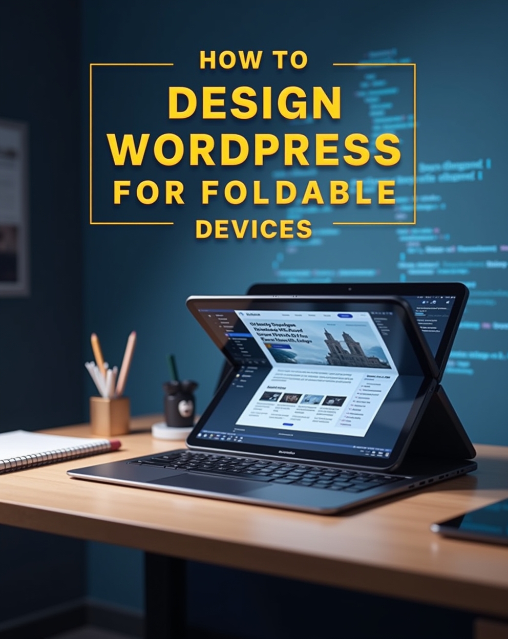
How to Design WordPress Sites for Foldable Devices: The Future-Responsive Guide
Preparing Your WordPress Site for the Next Generation of Flexible Screens
Foldable devices represent the next evolution in responsive design, requiring WordPress developers to think beyond traditional breakpoints. These innovative screens with folding displays, dual-screen setups, and adjustable viewports demand new approaches to ensure seamless user experiences across all states – folded, unfolded, tablet mode, and everything in between.
This comprehensive guide covers everything you need to adapt your WordPress site for foldable devices, from CSS viewport segment detection to content reorganization strategies.
Why Foldable Device Optimization Matters
- Growing Market Presence – Samsung Galaxy Z Fold/Flip, Microsoft Surface Duo, and more
- Unique UX Challenges – Screen gaps, aspect ratio changes, and multiple postures
- Competitive Advantage – Early adopters will stand out in SERPs
- Future-Proofing – Foldable tech is becoming mainstream
- Enhanced Experiences – Utilize dual-screen capabilities creatively. Our YouTube channel; https://www.youtube.com/@easythemestore
Key Considerations for Foldable WordPress Design
1. Viewport Adaptation Strategies
Screen Spanning Detection:
@media (spanning: single-fold-vertical) {
  /* Single screen mode CSS */
}

@media (spanning: none) {
  /* Traditional rectangular screen */
}
Fold Avoidance:
.safe-area {
  padding: env(fold-top) env(fold-right) env(fold-bottom) env(fold-left);
}
2. Content Reorganization Approaches
Dual-Screen Content Pairing:
if (window.getWindowSegments().length > 1) {
  document.querySelector('.secondary-content').style.display = 'block';
}
Adaptive Layout Shifts:
@media (screen-spanning: fold) {
  .product-gallery {
    grid-template-columns: 1fr 1fr;
    gap: env(fold-width);
  }
}
3. Touch Target Optimization
Ergonomic Placement:
@media (horizontal-viewport-segments: 2) {
  .cta-button {
    position: absolute;
    right: env(viewport-segment-width 0 0);
  }
}
Implementation Methods for WordPress
Option 1: CSS Foldable Adaptations
/* Fold-specific styles */
@supports (spanning: single-fold-vertical) {
  .main-navigation {
    flex-direction: column;
  }
}

/* Microsoft Surface Duo hinge */
@media (horizontal-viewport-segments: 2) {
  .hero-section {
    grid-column: span 2;
  }
}
Option 2: JavaScript Detection
// Detect foldable device
const isFoldable = () => {
  return (window.getWindowSegments && window.getWindowSegments().length > 1) ||
         (CSS.supports('spanning', 'single-fold-vertical'));
};

// Apply foldable-specific changes
if (isFoldable()) {
  document.body.classList.add('foldable-device');
  // Load dual-screen optimized assets
}
Option 3: WordPress Plugins
- Foldable Device Detector – Adds body classes for different states
- Dual Screen Content – Special widget for second screen content
- Responsive Breakpoints Plus – Adds foldable-specific breakpoints
Design Patterns for Foldables
Companion Pane Layout:
Main content on primary screen
Complementary info (cart, specs, etc.) on secondary
Continuous Spanning:
Treat two screens as one canvas
Account for hinge gap in design
Posture-Specific Views:
Book mode (vertical fold)
Tent mode (landscape folded)
Tablet mode (fully unfolded)
Dual-Screen Navigation:
Primary menu on left screen
Content on right screen
Testing and Debugging
Browser Emulators:
Chrome DevTools device mode
Microsoft Edge dual-screen emulator
Samsung DeX for foldable testing
Real Device Testing:
Check touch target accessibility
Verify hinge area content visibility
Test all device postures
Performance Considerations:
Optimize assets for dual-screen rendering
Minimize layout shifts during folding
Test memory usage in multi-window mode
Final Thoughts
Designing WordPress sites for foldable devices requires a paradigm shift from traditional responsive design. By implementing these strategies now, you’ll future-proof your websites and deliver exceptional experiences on the latest mobile hardware.
Key Takeaways:
- Use CSS environment variables for hinge awareness
- Design flexible content that adapts to multiple configurations
- Test across all device postures and states
- Consider dual-screen functionality as a feature, not a constraint
As foldable devices gain market share, early adopters of these techniques will have a distinct competitive advantage in delivering cutting-edge web experiences.