

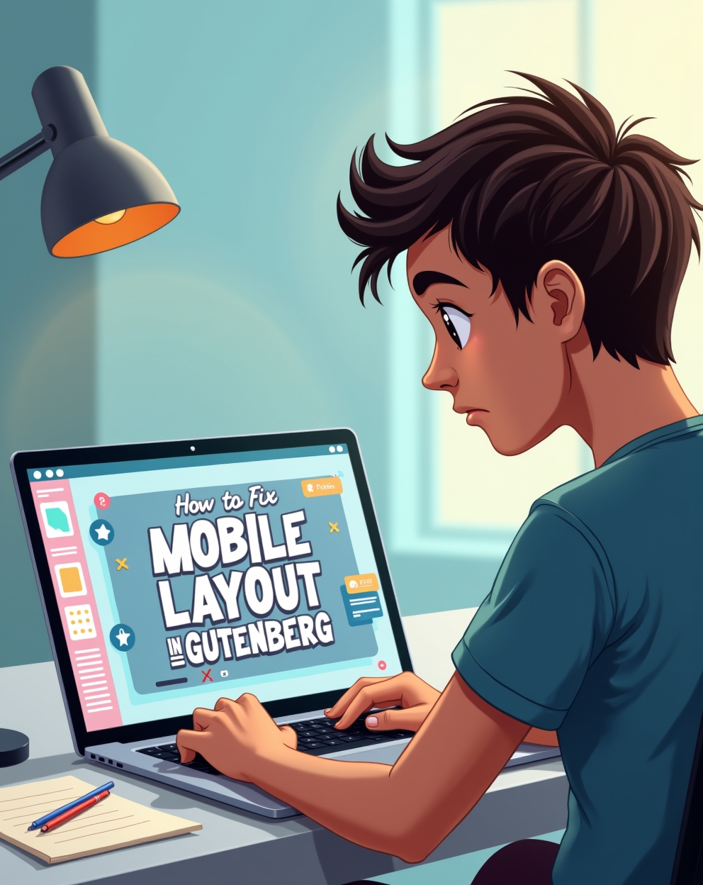
How to Fix Mobile Layout Issues in Gutenberg: A Comprehensive Guide
The Gutenberg editor in WordPress has revolutionized content creation, offering a block-based approach for designing rich layouts. However, one common challenge many users face is ensuring their layouts display correctly on mobile devices. Mobile responsiveness is crucial for SEO, user experience, and overall site performance. If your Gutenberg-designed pages look broken or misaligned on smartphones, this guide will help you diagnose and fix these issues effectively.
Common Mobile Layout Issues in Gutenberg
- Misaligned Blocks – Columns, buttons, or images may shift or stack incorrectly.
- Overflowing Content – Text or media extends beyond the screen width.
- Spacing Problems – Excessive gaps or cramped sections on mobile.
- Unresponsive Font Sizes – Text appears too small or too large on mobile.
- Hidden or Cut-off Elements – Important content gets clipped due to incorrect sizing.
How to Fix Mobile Layout Issues in Gutenberg
1. Use Gutenberg’s Built-in Mobile Preview
Gutenberg includes a responsive preview feature. Click the “View” dropdown in the top toolbar and select “Mobile” to see how your layout appears on smaller screens. Our YouTube channel; https://www.youtube.com/@easythemestore
2. Adjust Block Settings for Mobile
Many blocks (like Columns, Group, and Cover) have mobile-specific settings:
- Stacking Columns on Mobile – Enable the “Stack on mobile” option in Column blocks.
- Spacing Adjustments – Use the “Padding” and “Margin” controls to refine spacing for mobile.
3. Optimize Typography for Mobile
- Use relative units (rem, em, or %) instead of fixed px values.
- Enable responsive font sizes in the Typography settings.
4. Fix Overflowing Content
- Ensure images have
max-width: 100%in CSS. - Avoid fixed-width containers—use percentages or viewport units (vw).
5. Use CSS Media Queries for Fine-Tuning
If Gutenberg’s settings aren’t enough, add custom CSS:
@media (max-width: 767px) {
  .wp-block-columns {
    flex-direction: column !important;
  }
  .wp-block-button {
    width: 100% !important;
  }
}
6. Test on Real Devices
Use browser developer tools (Chrome DevTools) or real smartphones to test responsiveness.
7. Disable Conflicting Plugins
Some plugins may interfere with Gutenberg’s responsive behavior. Temporarily deactivate plugins to check for conflicts.
8. Use a Mobile-Friendly Theme
Ensure your WordPress theme is optimized for mobile. Themes like Astra, GeneratePress, and Kadence offer excellent Gutenberg support.
9. Check for Missing Viewport Meta Tag
Verify your site has:
<meta name="viewport" content="width=device-width, initial-scale=1">10. Consider a Page Builder Plugin
If Gutenberg’s limitations are too restrictive, plugins like Kadence Blocks or Spectra offer enhanced mobile controls.
Conclusion
Fixing mobile layout issues in Gutenberg requires a mix of built-in settings, CSS adjustments, and testing. By following these steps, you can ensure your content looks great on all devices, improving engagement and SEO rankings.