

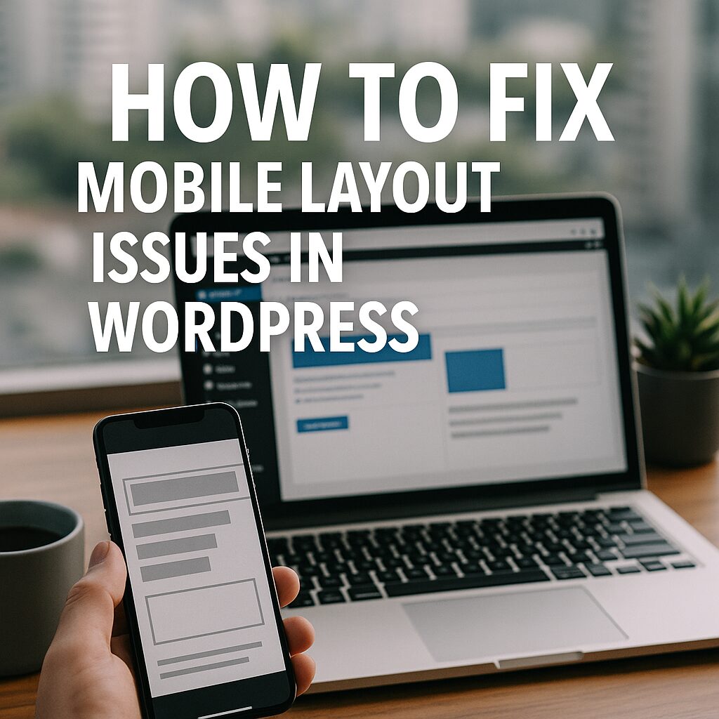
How to Fix Mobile Layout Issues in WordPress: A Step-by-Step Guide
A poorly optimized mobile layout can hurt user experience, increase bounce rates, and damage SEO rankings. Since Google prioritizes mobile-first indexing, ensuring your WordPress site looks and functions perfectly on smartphones and tablets is crucial.
In this guide, we’ll explore common mobile layout issues in WordPress and provide practical solutions to fix them.
Common Mobile Layout Issues in WordPress
- Text Overflow & Broken Layouts – Text or elements extend beyond screen edges.
- Tiny or Unreadable Text – Fonts too small on mobile devices.
- Misaligned or Overlapping Elements – Buttons, images, or menus stack incorrectly.
- Slow Loading Times – Heavy images or scripts delay rendering.
- Unresponsive Menus – Navigation breaks or becomes unusable.
- Clickable Elements Too Close Together – Users accidentally tap the wrong button. Our YouTube channel; https://www.youtube.com/@easythemestore
How to Fix Mobile Layout Issues in WordPress
1. Use a Responsive WordPress Theme
- Switch to a mobile-friendly theme like Astra, GeneratePress, or Neve.
- Avoid outdated themes that lack flexible grids and media queries.
2. Enable a Mobile Plugin (If Needed)
- WP Touch – Adds a mobile-friendly version of your site.
- AMP for WP – Accelerates mobile pages with Google AMP.
3. Adjust Font Sizes for Mobile
- Use relative units (rem, em, %) instead of fixed pixels (px).
- In Customizer > Additional CSS, add:
@media (max-width: 768px) {
  body { font-size: 16px; }
  h1 { font-size: 24px; }
}
4. Fix Overflowing Content
Prevent horizontal scrolling by adding:
html, body { overflow-x: hidden; }
Use CSS Flexbox or Grid for flexible layouts.
5. Optimize Images for Mobile
- Compress images (WebP format).
- Enable lazy loading (WordPress does this by default).
- Use srcset for responsive images.
6. Fix Menu & Touch Target Issues
- Ensure menus collapse into a hamburger icon on mobile.
- Increase button sizes (minimum 48×48 pixels).
- Add spacing between links:
@media (max-width: 768px) {
  a { padding: 12px; }
}
7. Check for Plugin Conflicts
- Disable plugins one by one to find the culprit.
- Replace heavy plugins (e.g., switch from a slider to static images).
8. Test & Validate with Mobile Tools
- Google Mobile-Friendly Test (link)
- Chrome DevTools (Device Mode)
- BrowserStack (for real-device testing)
Final Tips for a Flawless Mobile Experience
✔ Use a caching plugin (WP Rocket, LiteSpeed Cache).
✔ Minify CSS & JavaScript (Autoptimize plugin).
✔ Enable a CDN (Cloudflare, BunnyCDN).
✔ Monitor Core Web Vitals (LCP, FID, CLS).
Conclusion
Fixing mobile layout issues in WordPress improves SEO, reduces bounce rates, and enhances user experience. By following these steps—optimizing themes, adjusting CSS, fixing plugins, and testing thoroughly—you’ll ensure your site looks great on all devices.
By implementing these fixes, your WordPress site will load faster, look better, and rank higher on mobile searches. 📱🚀