

Responsive vs. Non-Responsive Themes: Why It Matters
In today’s digital landscape, having a website that adapts seamlessly to different devices is crucial. The choice between responsive and non-responsive themes can significantly impact user experience, search engine rankings, and overall website performance. Below is a detailed comparison explaining why this distinction matters.
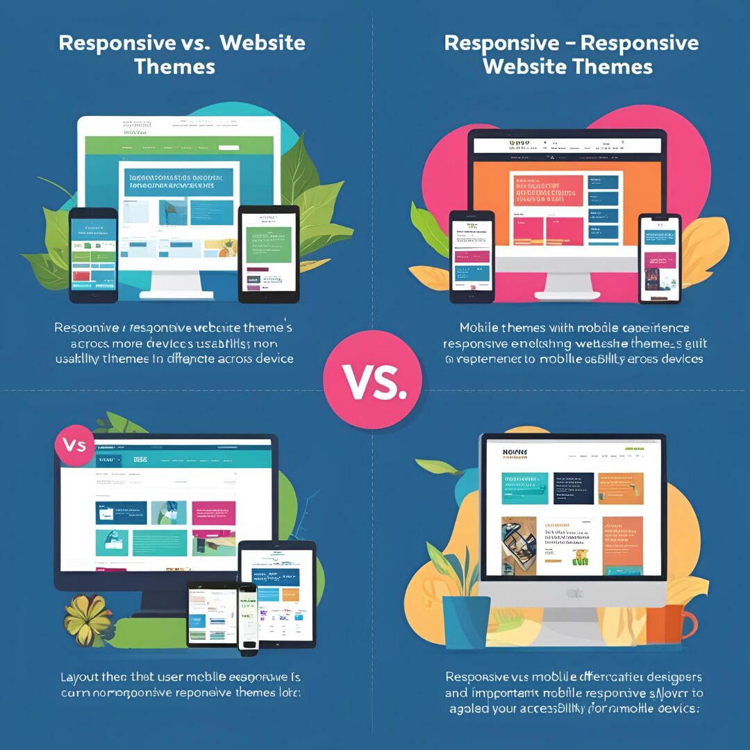
1. What Are Responsive and Non-Responsive Themes?
Responsive Themes
A responsive theme automatically adjusts its layout, images, and content to fit any screen size—whether viewed on a desktop, tablet, or smartphone. It uses flexible grids, fluid images, and CSS media queries to ensure optimal display across devices.
Key Features:
- Adapts to different screen resolutions.
- Improves mobile user experience.
- Enhances SEO performance.
- Reduces bounce rates by preventing zooming/scrolling issues.
Non-Responsive Themes
A non-responsive theme has a fixed layout designed for a specific screen size (usually desktop). When viewed on smaller screens, users must zoom in/out or scroll horizontally, leading to a poor browsing experience.
Key Features:
- Negatively impacts SEO rankings.
- Static design (does not adjust to screen size).
- May appear broken or distorted on mobile devices.
Higher bounce rates due to usability issues.
2. Why Does It Matter?
A. Mobile Usage Dominance
- Over 60% of global web traffic comes from mobile devices (Statista, 2023).
- Google uses mobile-first indexing, meaning it primarily crawls the mobile version of a site for ranking.
- A non-responsive site loses potential visitors due to poor mobile usability.
B. SEO Impact
- Google prioritizes mobile-friendly sites in search rankings.
- Non-responsive sites suffer from higher bounce rates, signaling poor user experience to search engines.
- Responsive design ensures consistent content across devices, avoiding duplicate content penalties.
C. User Experience (UX)
- A better UX increases engagement, conversions, and return visits.
- Responsive sites provide smooth navigation, readable text, and properly sized buttons on all devices.
Non-responsive themes force users to pinch-zoom or scroll horizontally, leading to frustration and abandonment
D. Maintenance & Cost Efficiency
- Responsive themes require a single design that works everywhere, reducing development and maintenance costs.
- Non-responsive themes may need a separate mobile site (m.domain.com), increasing complexity and expenses.
E. Faster Loading Times
- Responsive themes optimize media and layouts for different devices, improving load speed.
- Slow-loading non-responsive sites lose visitors, as 53% of users abandon a page that takes over 3 seconds to load (Google, 2022).
3. How to Check if a Theme is Responsive?
- Use Google’s Mobile-Friendly Test: https://search.google.com/test/mobile-friendly
- Manually resize your browser window—if elements adjust smoothly, it’s responsive.
- Test on real devices (smartphones, tablets).
- If you need more information, https://www.youtube.com/@easythemestore
4. Conclusion: Why Responsive Design Wins
Choosing a responsive theme is no longer optional—it’s essential for:
✔ Better SEO rankings
✔ Superior user experience
✔ Higher conversion rates
✔ Lower maintenance costs
✔ Future-proofing your website
Non-responsive themes may still work for niche desktop-only applications, but for most websites, responsiveness is a necessity in 2024 and beyond.